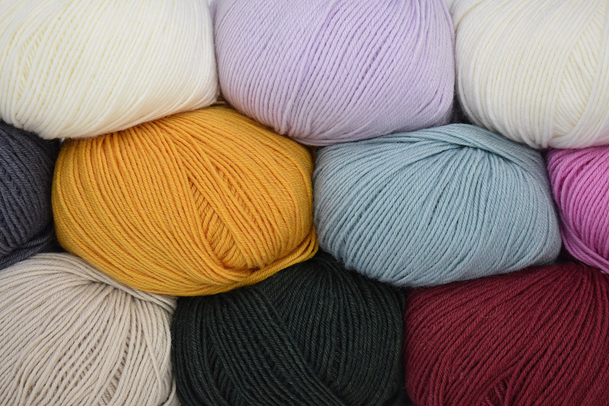
Happy Socktober! This year we’ve decided to celebrate with a mystery sock knitalong! I’m so excited about this month-long event and hope you’ll join in on the fun. We’re using the unsung hero of sock yarns, Bella Cash. Bella Cash is a yarn that blends extra fine merino, cashmere, and nylon for projects that are luxurious, soft, and durable.
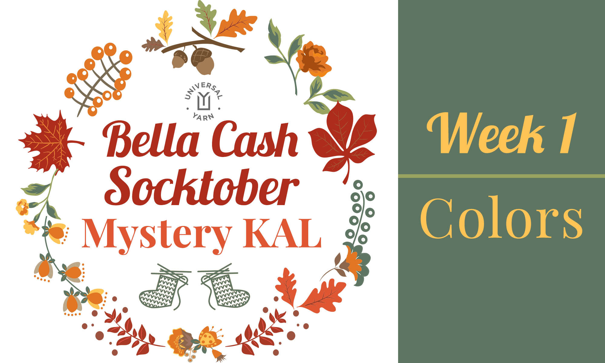
Use this graphic on Ravelry and on social media to share about the knitalong.
Let’s start with the knitty-gritty. Each week in October I’ll be revealing a different portion of the pattern with you in the following order:
9/30/20: Week 1 – Colors
10/7/20: Week 2 – The Cuff
10/14/20: Week 3 – The Leg
10/21/20: Week 4 – The Foot
10/28/20: Week 5 – The Toe & Heel
11/4/20: Week 6 – Wrap-up
If you join, we’d love for you to spread the love and share your progress on social media using the hashtag #UYSocktoberMKAL and tagging us on Instagram (link) and Facebook (link). Join in with chatter here on the blog and in our Ravelry forum (link).
Please add your project to Ravelry, too! You can find the Ravelry listing here (link). You can use the graphic above and on the Ravelry listing for your project page, too.
Does the thought of knitting something without knowing what it will look like first scare you? Not to worry – you can find spoiler images here (link).
Now that we’ve covered the details, let’s dive into the first week!
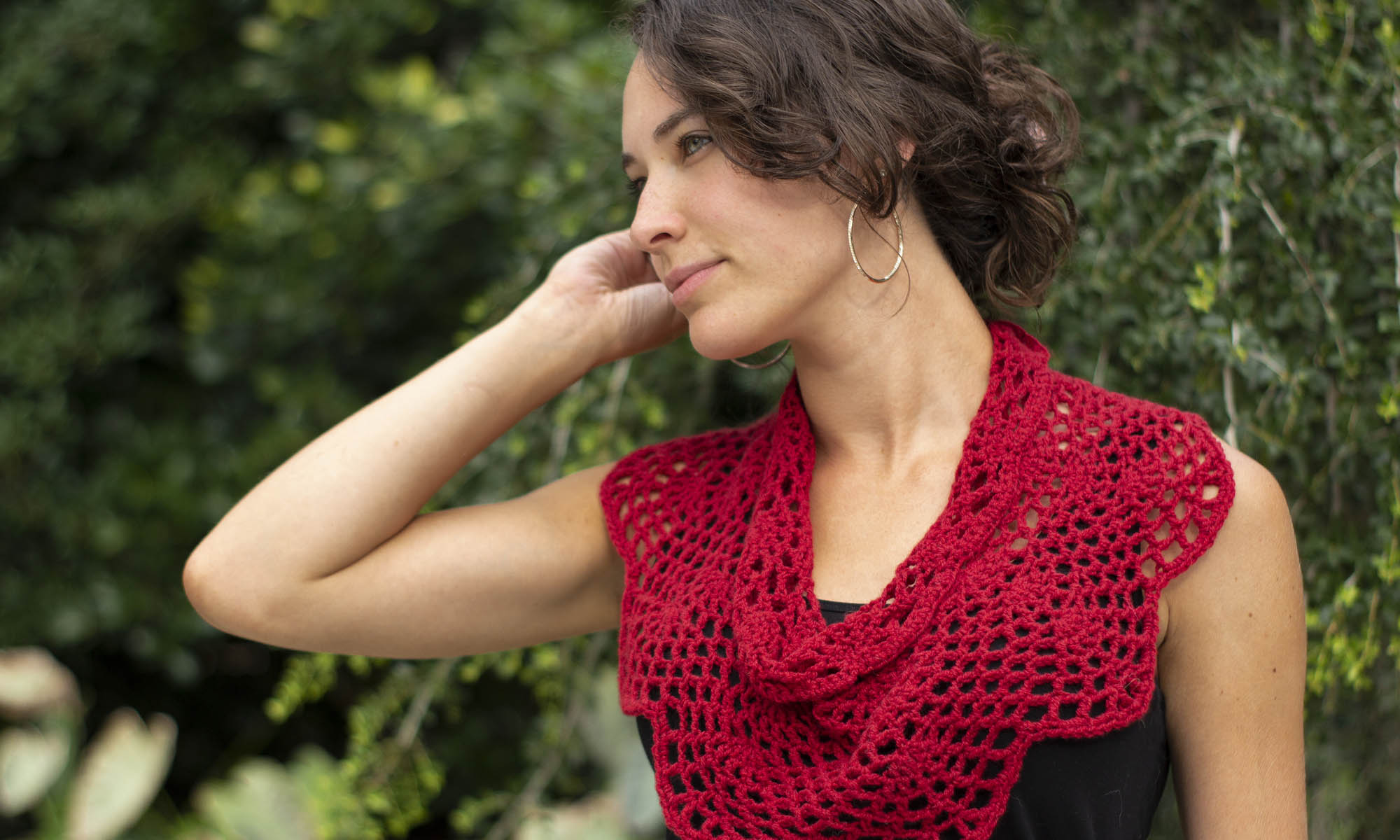
This week is all about preparing to knit your socks. The first thing you’ll need to do is choose your colors. The first segment of the pattern is available now (link) and it includes a bunch of information about choosing colors that make your heart sing. Everyone in the office is joining, and I’m going to share our color choices with you today.
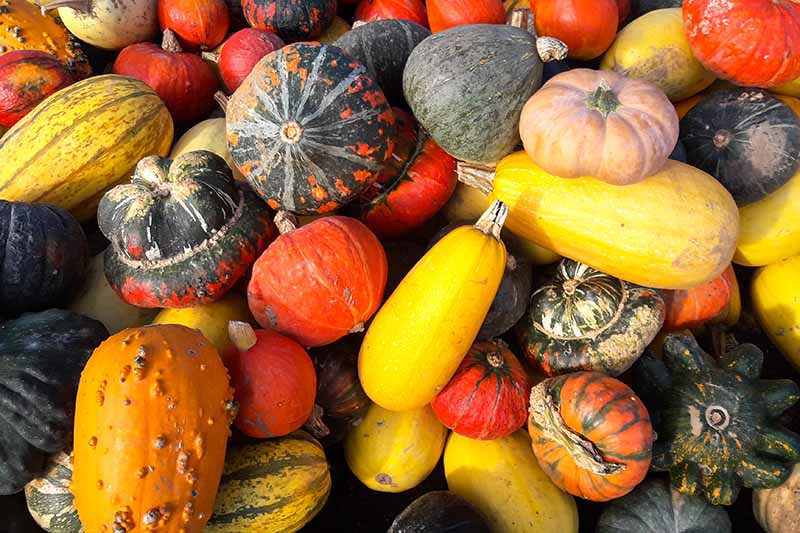
I’ll start with my own color choices. Put simply, I wanted my socks to exude all of the autumn vibes. I chose two colors with subtle contrast and one color to pop among them. I looked to colorful autumn squash, pumpkins, and gourds for inspiration. That’s actually why I’ve named these the Sweet Dumplin’ Socks. They’re named after the delicious and colorful variety of squash (bonus recipe ideas here!).
You can’t have a knitalong solo, so I was thrilled when Aubrey, Heather, and Yonca told me they wanted to join. I asked each of them to tell me a little bit about their color selections.
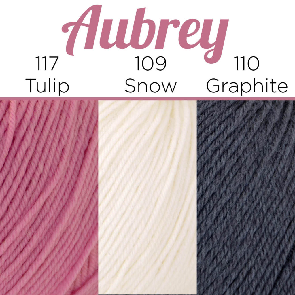
Fellow designer and Instagram maven, Aubrey, chose colors that remind me of Valentine’s Day. Here is what she had to say:
“I’m a die-hard romantic, and I love nature. I chose to pick a trio that expressed the contrast between softness and harshness found in nature. In this case roses – my favorite (very romantic) flowers, and marble. I’ve always loved gemstones and geology. I’m so looking forward to wearing my socks while I indulge in some favorite movies and warm tea during the cold months coming up!“
Her selection is so beautiful, and it’s lovely to see the vibrant pink hue paired with two neutrals. It makes me picture a vase of beautiful pink roses on a gorgeous marble countertop.
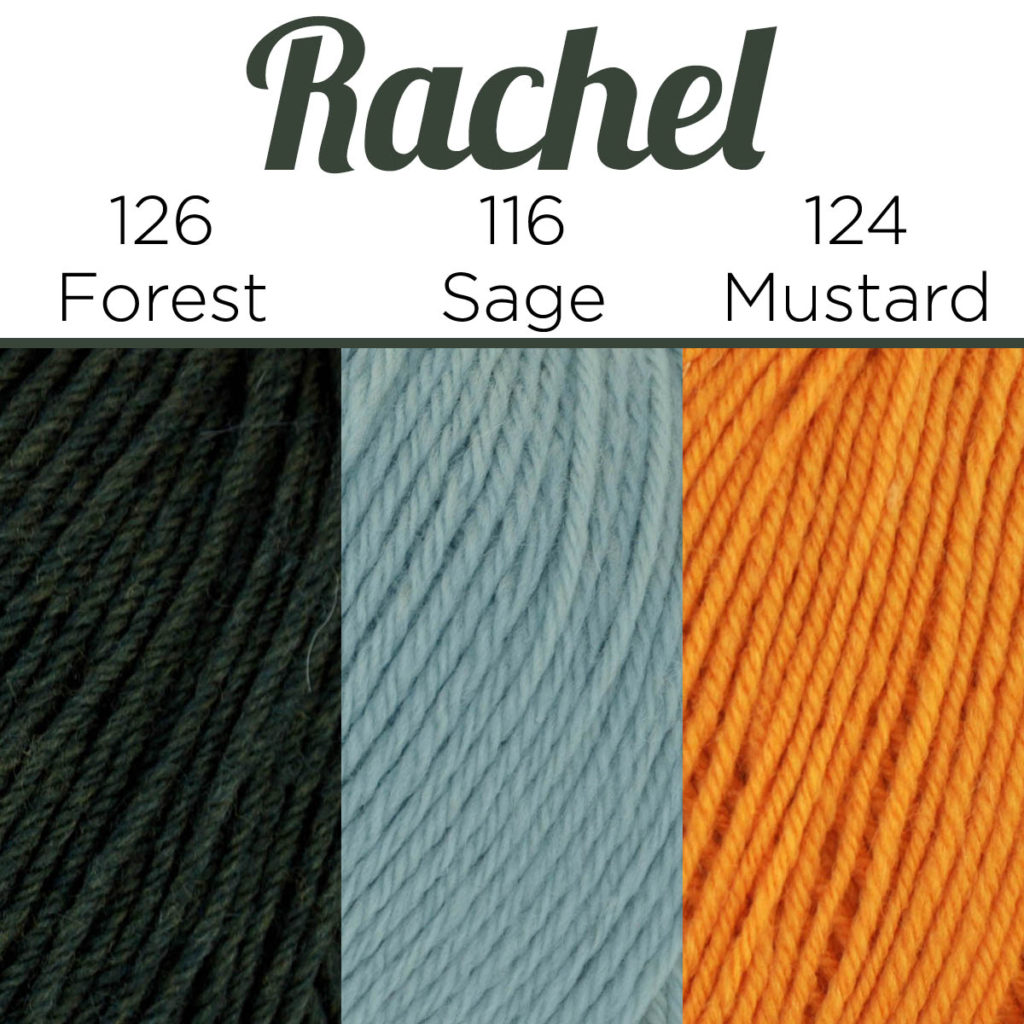
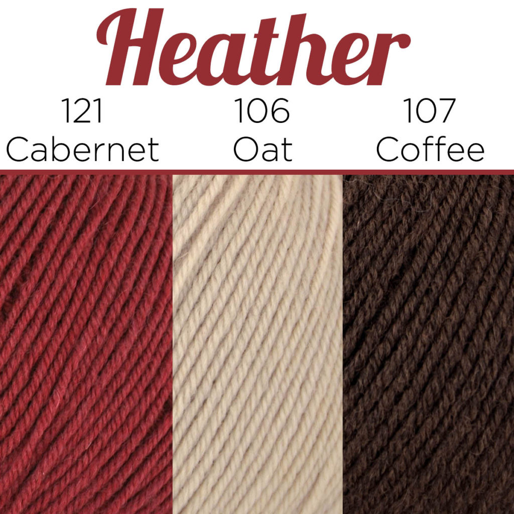
When Heather, our social media connoisseur, agreed to join, my initial hunch was that she’d choose some blissful blues for her socks. She surprised me, though, with this earthy color combination.
“When I heard about Rachel’s concept for fall socks, I decided to lean into it. Normally I go for blue tones, but this time I decided to embrace the season. I’m calling mine Hot Choco Sockos, and am looking forward to sipping some marshmallow-topped hot chocolate while wearing my completed socks. Rachel actually shared a really great spicy hot cocoa recipe last winter that I’m going to use. You can find it here.”
As an autumn-colors gal, I’m smitten with this combination! They are aptly named, and I’m pretty sure a nice mug of Mexican hot chocolate would be perfect for sipping between rows while knitting.
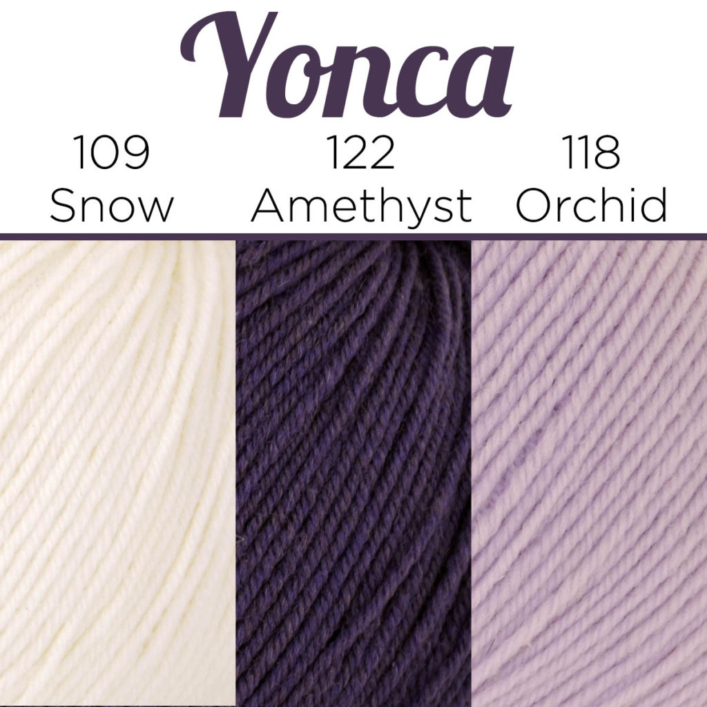
Last, but certainly not least is Yonca, our fabulous managing director. I love her combination of a beautiful jewel tone with a pretty pastel and snowy white. When I asked her about her colors, here is what she said:
“I’ve always loved shades of pink and purple, but for some reason, I haven’t worn those colors in years. This knitalong seemed like the perfect opportunity to introduce a little more color to my wardrobe.”
I love how different all of our colors are. There is nearly no overlap between our color choices. With 26 colors of Bella Cash to choose from, there is a virtual cornucopia of color combinations. The color wheel is a useful tool for understanding how colors interact with one another.
In this week’s portion of the pattern, I chat a little bit about how you can use the color wheel as a tool for helping you choose colors. You’re probably already familiar with the primary colors: red, yellow, and blue, as well as the secondary colors: orange, green, purple. However, have you thought about how to use these colors together?
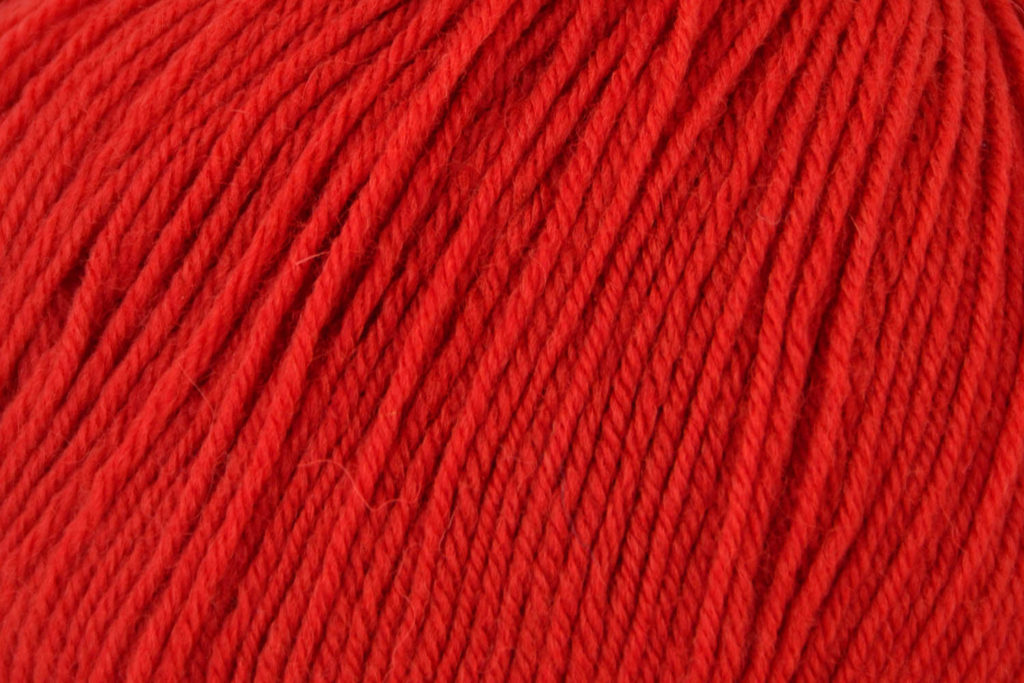
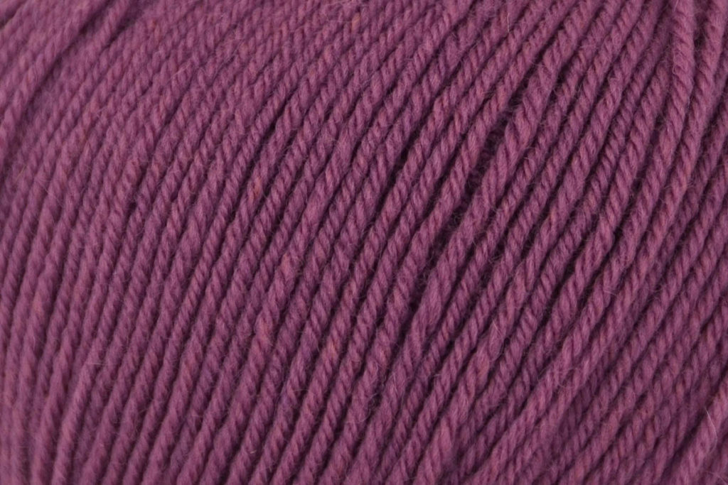
Looking at the color wheel I’ve created above, you can see arrows that point to colors that are complementary to one another. Complementary colors are opposite hues on the color wheel, for example, red and green. These colors create a strong contrast when placed next to one another. Choosing opposite colors would be a great starting point when selecting the main or contrast color for your socks. Take a look at the combination below for a great example of how you could combine complementary colors in your socks.
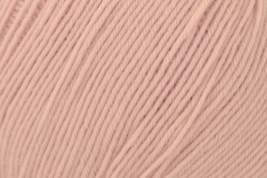
Left to Right: #102 Blush, #120 Pistachio, #101 Apple
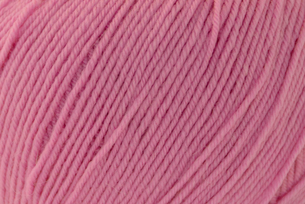
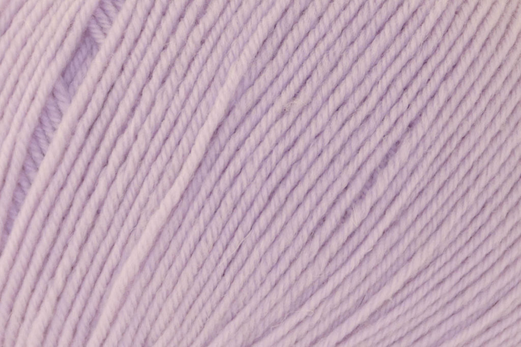
You could also choose to use analogous colors. Analogous colors are colors that are next to each other on the color wheel. One example of this would be the colors between red and purple. Purple, pink, and red are analogous colors, which are shown in Bella Cash colors below.
Left to Right: #103 Violet, #117 Tulip, #118 Orchid
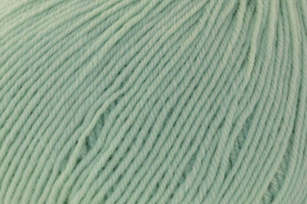
Monochromatic colors are all colors of the same hue. You might also refer to this as a gradient of colors – think of a greyscale, but all the same hue.
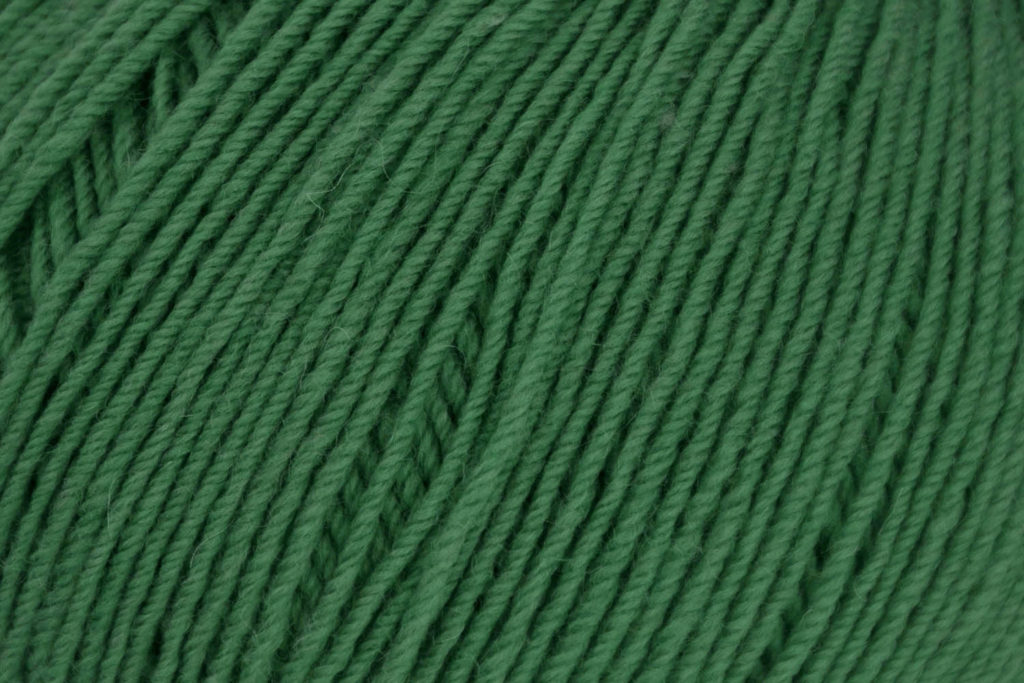
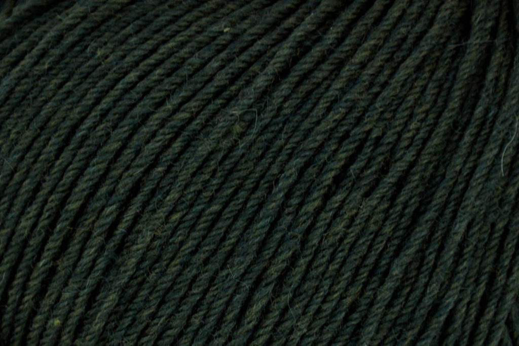
Left to Right: 120 Pistachio, 125 Emerald, & 126 Forest
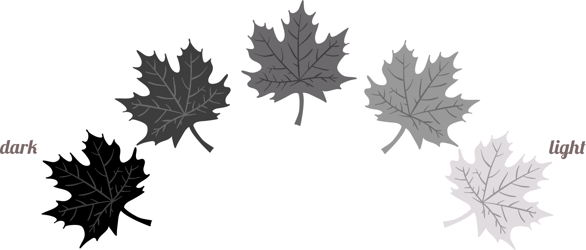
Speaking of a greyscale, another factor to consider when selecting your colors is their value. Value is the relative lightness or darkness of a color. A greyscale is a great way to think about value of a color.
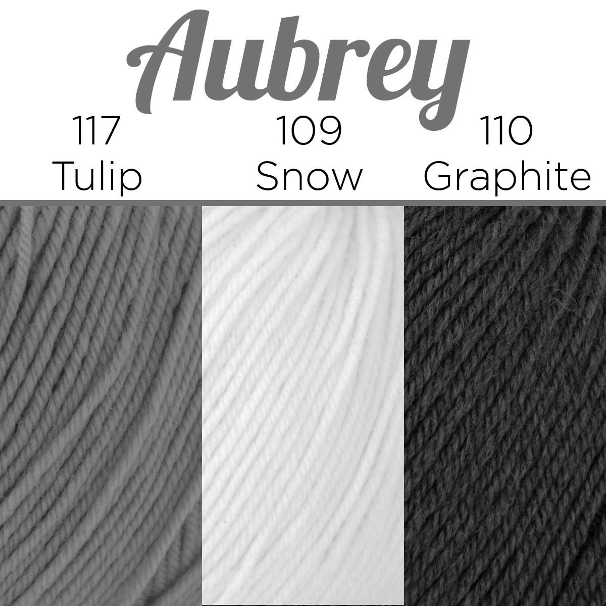
Like I mentioned earlier, I chose two colors with subtle contrast and one very dark color to pop among them. You could also choose colors that have a dark, medium, and light value so that each color pops even more. Aubrey’s palette is a great example of dark-medium-light. Notice how there is a clear distinction in the darkness and lightness between each of her colors. If you aren’t sure how your colors will look together, you can take a quick snapshot with your phone using black and white mode.
Need more inspiration? Take a look at the first part of the pattern. I highlight more color combinations and chat a bit about the color wheel, much like I’ve done in this post. Whatever colors you choose, I’m sure you’re going to create a beautiful pair of socks! What colors do you have in mind? Let us know in the comments below!