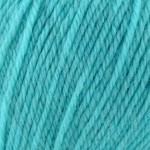
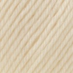
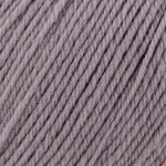
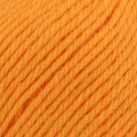
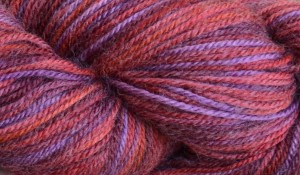
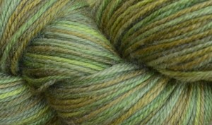
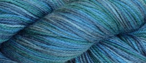
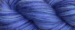
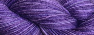
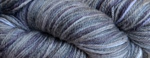
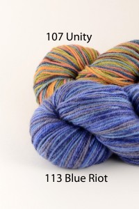
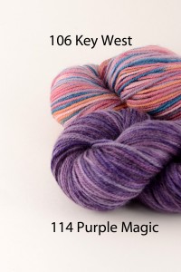
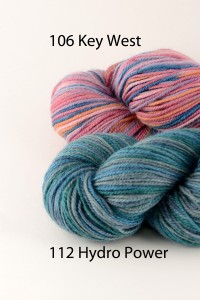
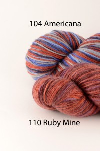
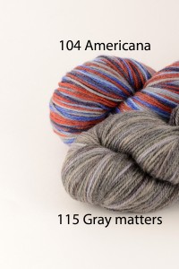
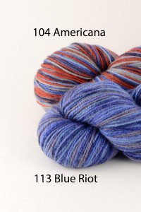
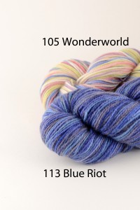
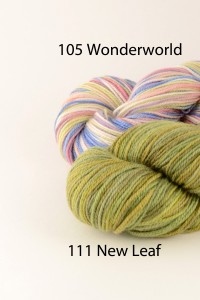
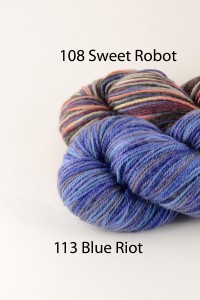
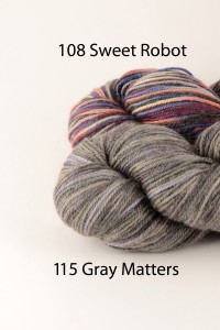
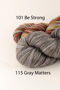
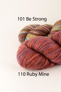
I’m pretty excited. Last week, we got our first shipment of Infusion Handpaints new colors here at our warehouse in Harrisburg, NC: Six brilliant shades to coordinate with existing colorways of Infusion.


I was quoted as saying, “Oh man, all I want to do is knit with this stuff for the next month. Nothing else.” Fortunately I’ve had some time to work with the new colors, but let’s face it, I still need to eat, sleep and work.
There are a lot of things I love about this yarn, not just the delightful colorways. It is machine washable. It’s sportweight, making it great for socks, garments, and accessories. It’s an all-around joy!
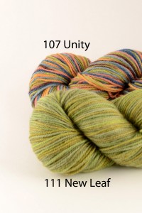
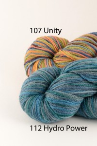
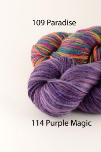
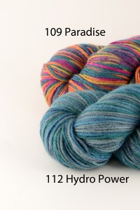
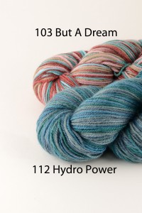
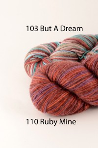
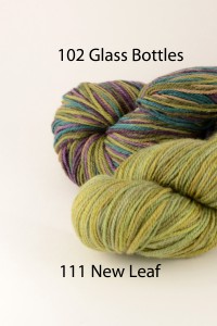
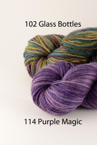
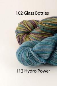
As you can see, the new colorways are tonal, meaning all the shades in each color are very close to one another and belong to the same color family. Each of these tonal colorways was designed specifically to coordinate with the earlier multis. Because it can be tough to pair colors with one another without having the benefit of having all the skeins with one in person, I’ve put together this handy guide. Each of the groupings below illustrates a multi (color numbers 101-109) along with the new tonal colors (color numbers 110-115) that have an exact match with one or more shades.


As you can see, each multi colorway has either 2 or 3 tonal colors that is a direct match. Here is an example of 103 But a Dream paired up with 110 Ruby Mine:

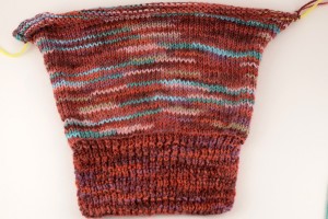
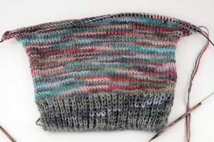
As you can see, this yarn has decided to be a sweater. The sleeve cuff here is worked in 110 in a simple broken rib pattern. The sleeve uses both 103 & 110, alternating every 2 rows. You can see the luscious blending that occurs, since both colorways share some of the same red tones.
Here’s a second example, this time using the same multi (103 But a Dream), but paired with a contrasting tonal color, 115 Gray Matters.

Here I’ve worked a shorter cuff in a slipped 1×1 rib, using just color 115. Again, I’ve striped 115 & 103, changing colors every 2 rows. As you can see, the striping is more pronounced. It would be even more so using more highly contrasting shades.
I haven’t decided which version to proceed with yet – I love them both! It really is like watching a watercolor painting grace the canvas right before my eyes while knitting.
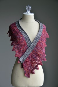
The tonal colors work great all on their own, as seen here in the Razor’s Edge Shawlette:

Instead of using 2 tonals, I think this project would also look great worked using a multi in place of the gray, and sticking with a tonal color for the red.
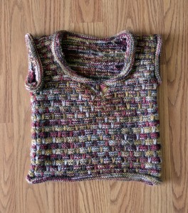
And heck, the multis look great all on their own, too. Using a slipped stitch pattern, a classic method of “mixing” handpaint variegated yarn, this little vest would look adorable in any of the colorways.

Enjoy, I know I am!
